The current generation of MPCs, which started with the Touch then went stand-alone with the Live and MPC X, represent a big leap forward for the platform. But as innovative as they are, they consciously maintain the traditional working methods and project structure of the MPC, with its walled-off song sections.
I spent a lot of time trying to get into the groove of MPC workflow; I really wanted to like it because I love the self-contained hardware. But I’ve spent too long using grooveboxes and workstations based around clips, patterns and scenes. In previous conversations, the Akai team have been patient with me, suggesting that what I was looking for was essentially a different product… and it turns out they already had that product in mind.
The Force doesn’t share the MPC’s name, but it does incorporate a lot of its technology, repurposed into a new framework that closely resembles Ableton Live’s Session view. This is not such a big departure when you consider that Akai created the first dedicated controller for Live (the APC40) and co-engineered the first Push. In fact the Force doubles as a Live controller, a job it can do at the same time as running stand-alone.
Brute Force
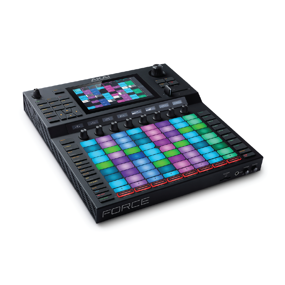
The Force is a beast. It looks a bit like a Push has been bolted onto an MPC Live, to the extent that when I first saw those leaked photos of it I assumed it was photoshopped. For comparison it has a slightly bigger footprint than a Push turned to portrait orientation. It’s about twice as thick and pretty heavy, but remember this thing can replace your laptop and your controller. It’s not as compact and portable as the MPC Live, and sadly doesn’t have an internal battery, but it’s certainly less cumbersome than the MPC X.
The panel is split across two levels, connected by a sloped section that puts the eight encoder displays at a nice viewing angle. The top section has a 7-inch touchscreen, transport, navigation and mode buttons, and a crossfader. The lower deck follows the familiar 8×9 clip/scene launch grid, and has the same diamond centre cutout as the Push and the Launchpad to denote the quadrants. A column to the left has pad modes, clip functions, and track-based functions that work in combination with buttons below the grid.
The front edge presents a conveniently placed headphone jack with independent level control, and a cue mix blender. All other audio connectivity is at the back. Most notably there are two multi-format analogue inputs which can handle mic, line and instrument sources. This was the missing link on the MPC Live. Being able to plug in mics and guitars directly made the Force my go-to device throughout my time with it.
Getting Around
The Force structures everything around Tracks. You make audio tracks (up to eight) for playing or recording audio clips and MIDI or CV Tracks (up to 128) for sequencing external instruments. Plug-in tracks, drum tracks and Keygroup tracks are all variations of instrument tracks that specialise in the Force’s different internal sound engines. Where an MPC project can have multiple sections set up in different ways, with independence between tracks and instruments, a Force project follows a much more conventional DAW approach using one track per instrument and a single layout shared by all Scenes.
The Force’s Matrix view provides the main view into a project and closely follows the Live Session View concept. On the off chance that you’ve not seen the Ableton paradigm before, Tracks are arranged horizontally on a grid, with the notes or audio clips that belong to each track stacked in columns below. One clip per track can play in any combination, and you can trigger a whole row with the Scene launch buttons. You can select tracks and launch clips and Scenes from either the pad grid or the touchscreen.






















รีวิว
Clear filtersยังไม่มีบทวิจารณ์